Mental Matters | End-to End Mobile Design
OVERVIEW
Mental Matters is a conceptual mental health mobile application designed to connect young adults with a trained peer counselor as well as find general mental health resources.
ROLE & RESPONSIBILITIES
UX/UI designer responsible for user research, UX/UI design, branding, prototyping, and usability testing
TIMELINE & TOOLS
80 hours utilizing Figma, Miro, and Maze
THE CHALLENGE
Often times young adults don’t have access to affordable mental healthcare and, therefore, cannot speak with licensed professionals to better understand their situation. Other times, they face the stigma attached to mental health and do not feel comfortable reaching out for help.
THE SOLUTION
Mental Matters would provide young adults with easy access to find a trained peer counselor to chat with based on information such as a counselor’s gender, race, or by mental health topic, etc. in order to help ease their potential hesitation with seeking help.
Research
How many young adults seek mental health services? What resources are available to them?
COMPETITIVE RESEARCH
Services such as BetterHelp and Talkspace provide 24/7 chatting with therapists and also provide some mental health resources. The biggest downsides of these services are the fees and limited freedom with selecting a therapist. For both services, users first complete a survey to get matched with a therapist instead of being able to filter on their own.
GENERAL STATISTICS
In 2019, 38.9% of young adults between the ages of 18-25 with a mental illness received mental health services which was less than adults aged 26-49 (45.4%) and those aged 50+ (47.2%) (via National Institute of Mental Health)
67% of young people between ages 18-24 with anxiety or depression don’t seek treatment (via Active Minds)
Cultural competence is important for patients of color to feel that they are receiving quality care (Meyer & Zan, 2013)
User Interviews
What are folk’s thoughts on mental health? What does seeking help look like?
RESEARCH GOALS
Understand how users view mental health in general and what their current coping behaviors/strategies are
Determine if a mental health provider’s race, ethnicity, gender, etc. affects user’s comfortability with seeking help
Determine what mental health resources would be helpful to users
PROCESS & PARTICIPANTS
Online Survey
32 participants
93.8% were between the ages of 18-25
93.7% were people of color
90.6% identified as female
User Interviews
5 participants
Between the ages of 18-30
All were people of color
3 females, 2 males
FINDINGS
From the survey, 43.7% of folks have previously sought out professional help for their mental health and 15.6% were actively considering seeking help
Common reasons for why people did not seek professional help was due to stigma associated with mental health and insurance/pricing of services
When looking for a professional to speak with, 65.6% valued knowing the provider’s gender, 59.4% valued their experience & speciality, 37.5% valued what language they spoke, and 34.4% valued their ethnicity
71.9% noted they would prefer to speak with someone with the same cultural background as them
From the interviews, participants verified that they would feel more comfortable speaking to someone from a similar cultural background because they felt they would be more empathetic to their situation
Younger participants noted they would be interested in using an app where they could speak with someone without insurance because they don’t fully understand how much their insurance would be able to cover mental health services
Most participants prefer to speak with a professional either over the phone or through a video call because they feel it’s easier to communicate
Empathy
Who are we designing for?
EMPATHY MAP
It’s helpful to dive deeper into what Jasmine says, thinks, does, and feel in order to assure her needs and goals are being met.
PERSONA
To better empathize with who I was designing for, I created Jasmine - a young adult seeking support with her stress and anxiety.
JOURNEY MAP
How might someone like Jasmine navigate through our mental health app and what would they be feeling?
Information Architecture
What screens are necessary to complete users’ goals?
The main task a user would want to complete would be to start a chat with a counselor.
The user flow includes the decision points a user may come across as they are navigating through the app trying to find a counselor to chat with or looking for mental health resources in general.
UI Kit
To hone in the styling and feel of the app along with the components, a UI Kit was put together.
Wireframes
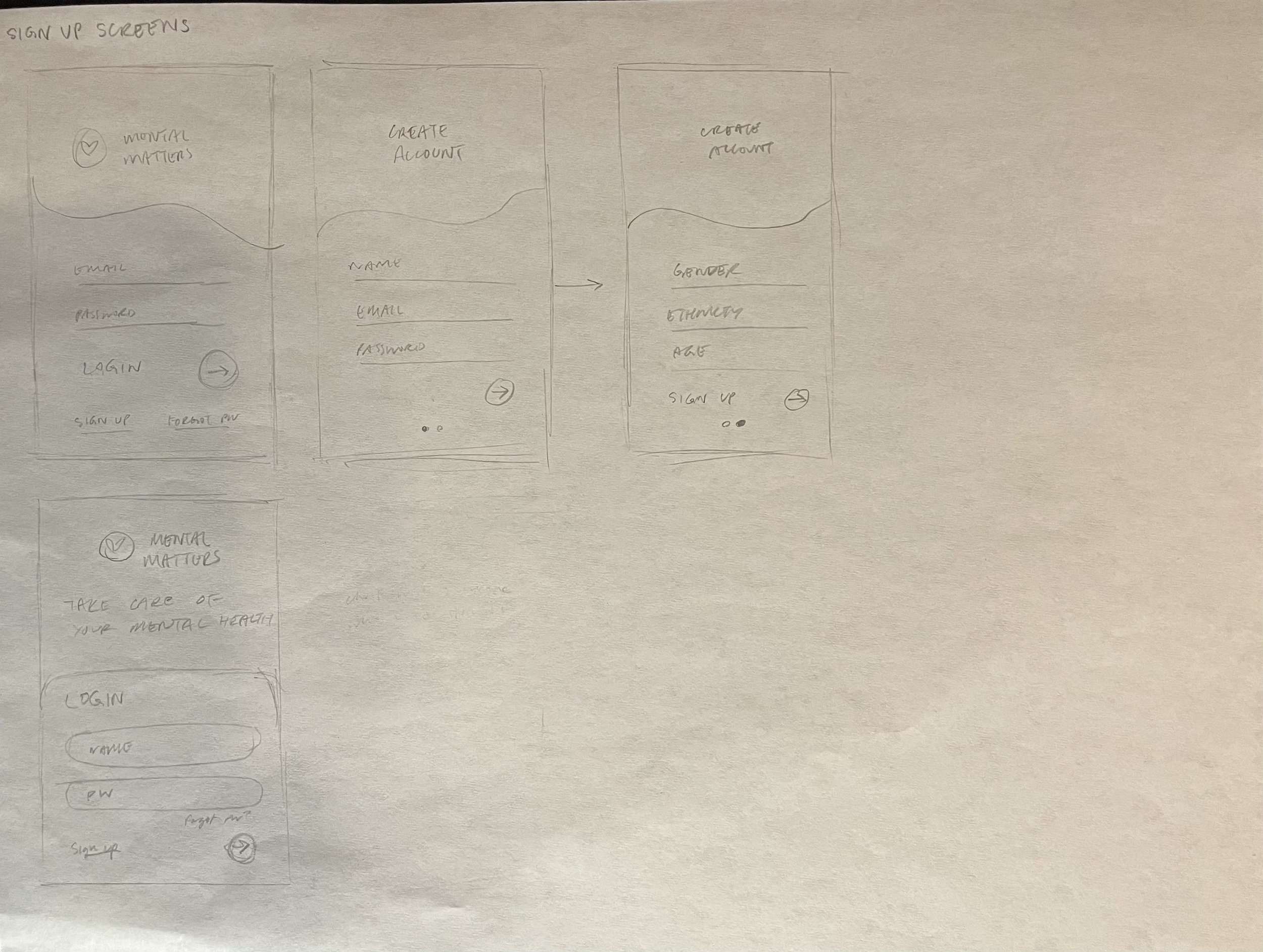
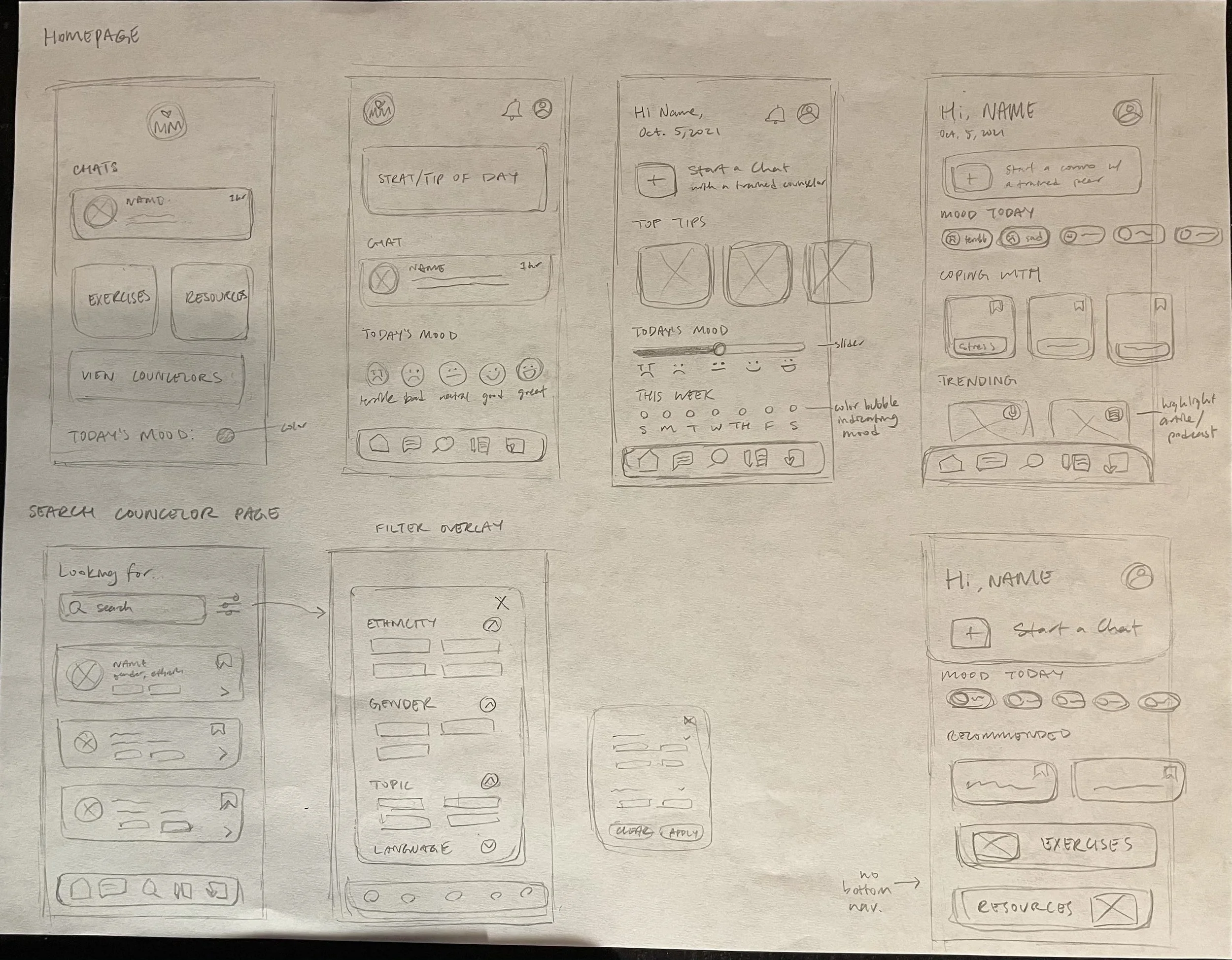
To kick off my iteration process, I began by sketching low-fidelity wireframes.
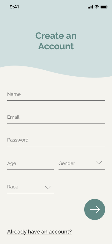
Login Screen: what a user will first see when opening the app
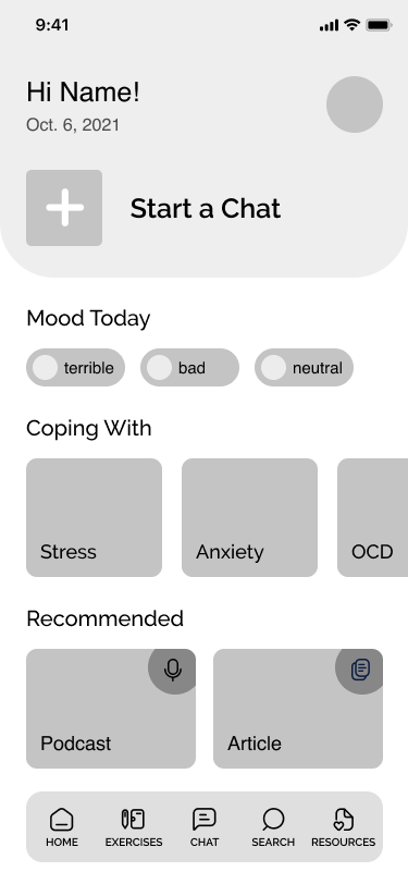
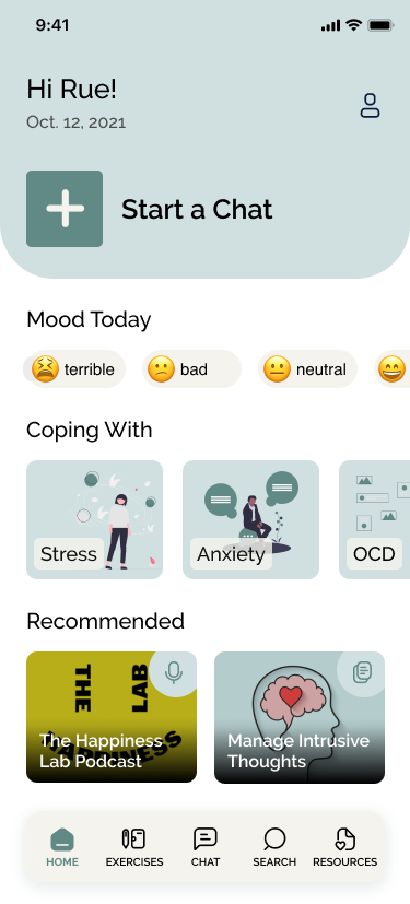
Home Screen: displays a main CTA to begin chatting with a counselor, a mood tracker, and helpful resources
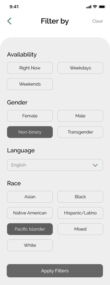
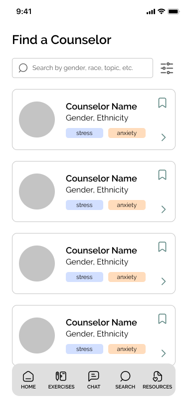
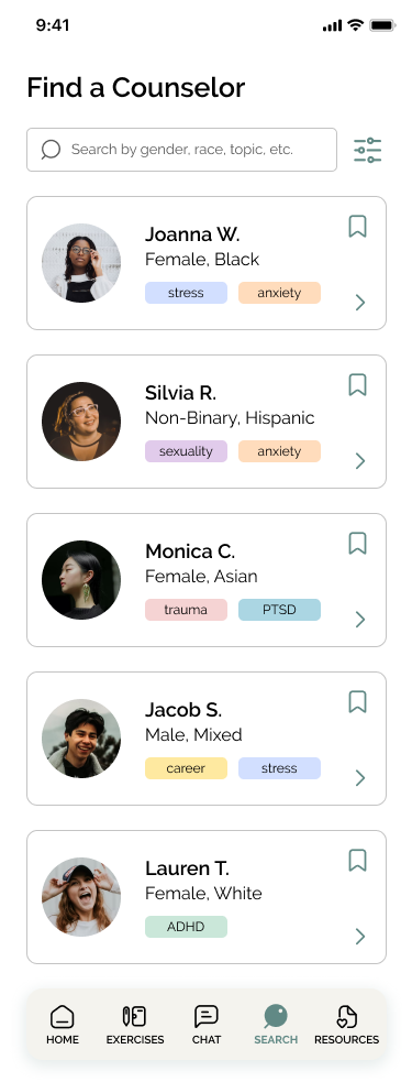
Counselor Search Screen: displays a list of counselors with information like what topics counselors are open to discussing, their gender, and their race
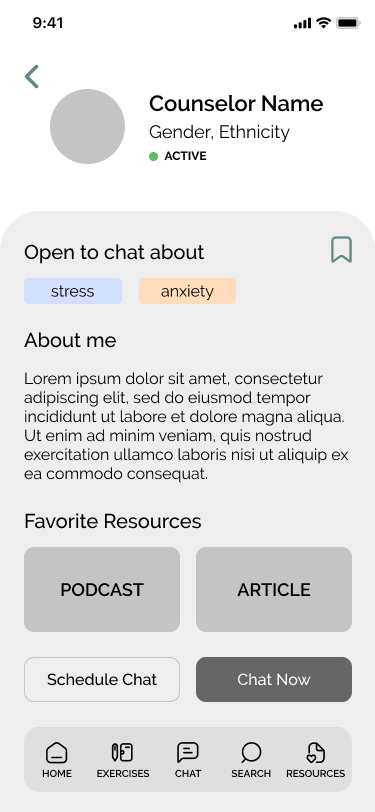
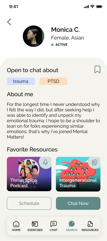
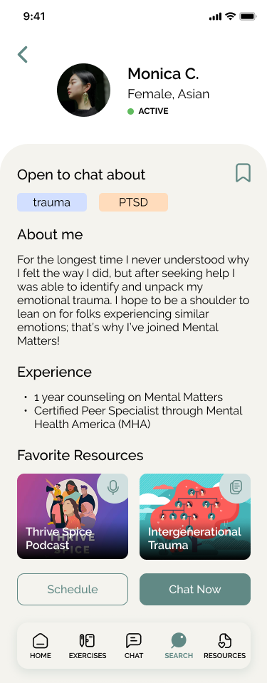
Counselor Profile Screen: provides more information about a counselor to help users decide if they want to begin a chat with them
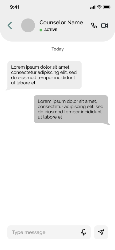
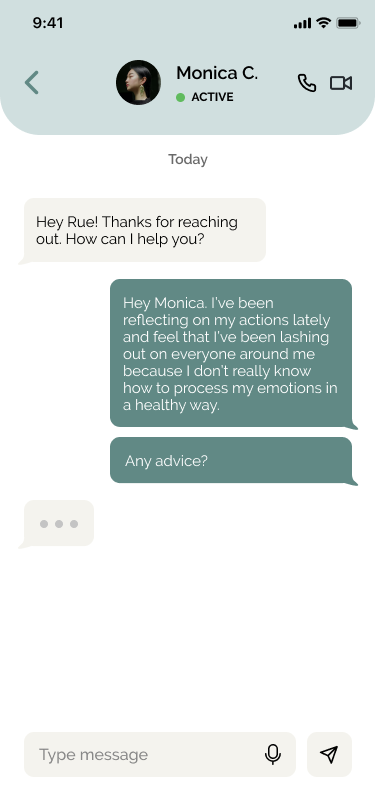
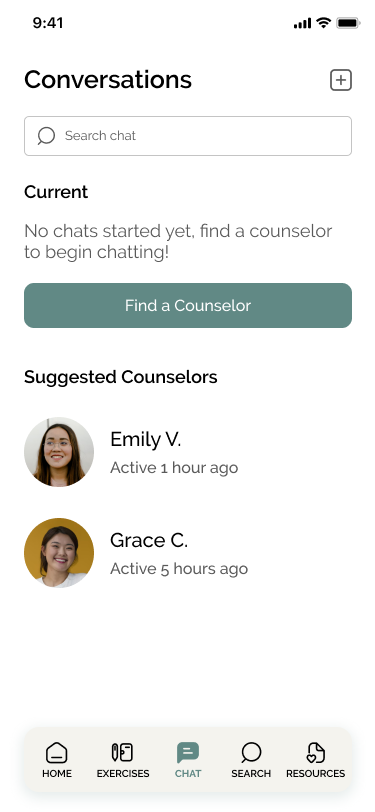
Chat Screen: displays how a user will interact with a counselor - mainly via chat, but with the option for phone & video calls
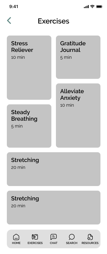
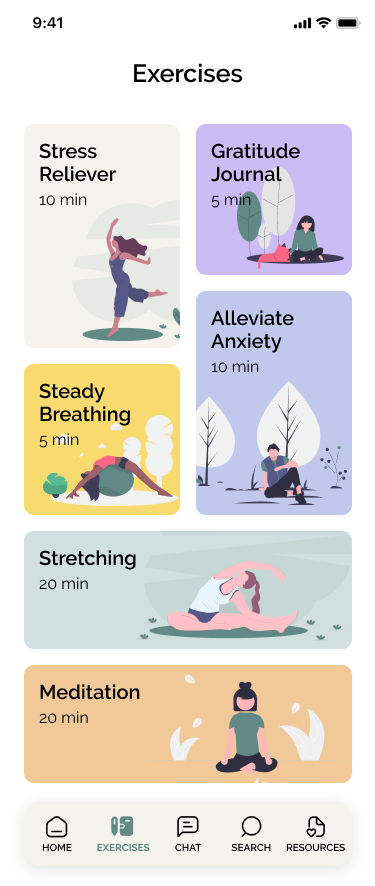
Exercise Screen: a variety of exercises that help users improve their mental health
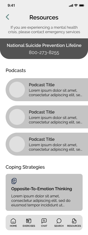
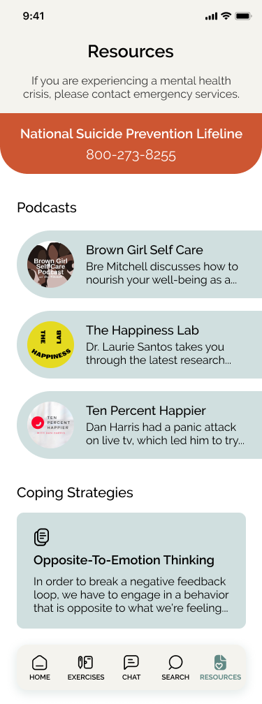
Resources Screen: has emergency phone numbers, podcasts centered around mental health, and articles that explain coping strategies
Mid-Fidelity Wireframes
After receiving feedback on my lo-fi sketches from my mentor and design peers, I revised the homepage by combining elements from multiple iterations. Ultimately, I decided to follow conventions and include a bottom navigation so users would be able to explore the app intuitively.


High Fidelity Wireframes
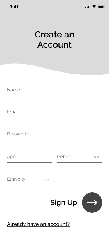
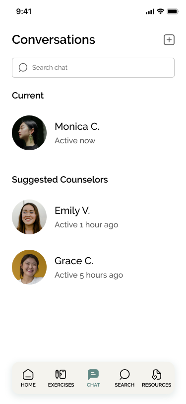
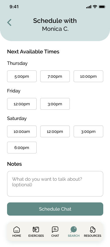
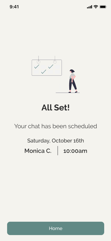
Once the mid-fi wireframes were reviewed, I began designing the hi-fi wireframes and adding screens that would be necessary to create a complete prototype for the MVP.


Usability Testing
How well does the design work?
PARTICIPANTS & TASKS
13 total participants:
1 in-person test; 4 virtual tests
8 participants via Maze online testing
4 tasks to complete:
Create an account
Find a counselor who is available to chat now and identifies as female and Asian
Schedule a chat with a counselor on Saturday at 10am
Find more general information about mental health
FINDINGS
All participants were able to complete all tasks
Tasks 1, 3, and 4 had error-free rates of 100%
Task 2 had an error-free rate of 77%
Some users had navigated to the Chat screen via the bottom navigation from the home screen which was an unexpected path
Chat screen displayed information that a returning user who had already begun a chat would see
Most participants assumed that the counselors were licensed professionals and noted wanted to know more information about their specialties/years of experience
Overall, participants liked the app’s concept and enjoyed the additional exercise & resource screens
FURTHER ITERATIONS
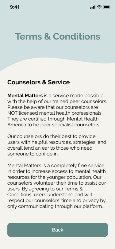
Since most participants had to be reminded that the counselors were not licensed professionals, I adjusted the text and descriptions on the sign up, homepage, and counselor profile screens to be more explicit about the counselors’ experience level.
One user also noted that the phrasing of “Start a Chat” on the homepage made them hesitant at first because they weren’t sure if it would instantaneously open a chat with a counselor or if it would open a page to view counselors first. They also noted that when they were scheduling a chat, they weren’t sure if they were scheduling a phone call or video call. With those comments in mind, I adjusted the phrasing on those CTA buttons to be more clear.
View iterated screens below.



Final Product
View a walkthrough of the final prototype below or explore it yourself!
NEXT STEPS & LESSONS
When brainstorming what challenge I wanted to try and solve with a mobile application, I kept thinking about the young people I work with. Mental health has luckily become less stigmatized, but the access that young people have to affordable or free mental health resources are few and far between.
One of the biggest challenges I faced during the beginning of this project was being mindful of the legalities and how most states in the US require folks under the age of 18 to have consent from a parent/guardian before being able to accept mental health treatment. If a teen is experiencing negative emotions due to their parents, it would make seeking help even harder. Moving the project towards a peer-trained counselor model helped increase accessibility to a younger demographic.
Having the mindset that this app was really going to launch made me think critically about all my design decisions. For next steps, I’d like to build out the exercise and resources pages to show how a user would interact with the app outside the main chatting feature. In the distant future, I would like further research how this app could potentially launch — either as a white label product for universities and high schools or connecting it with existing hotlines.


