Justin Joo Weddings | Responsive Web Redesign
OVERVIEW
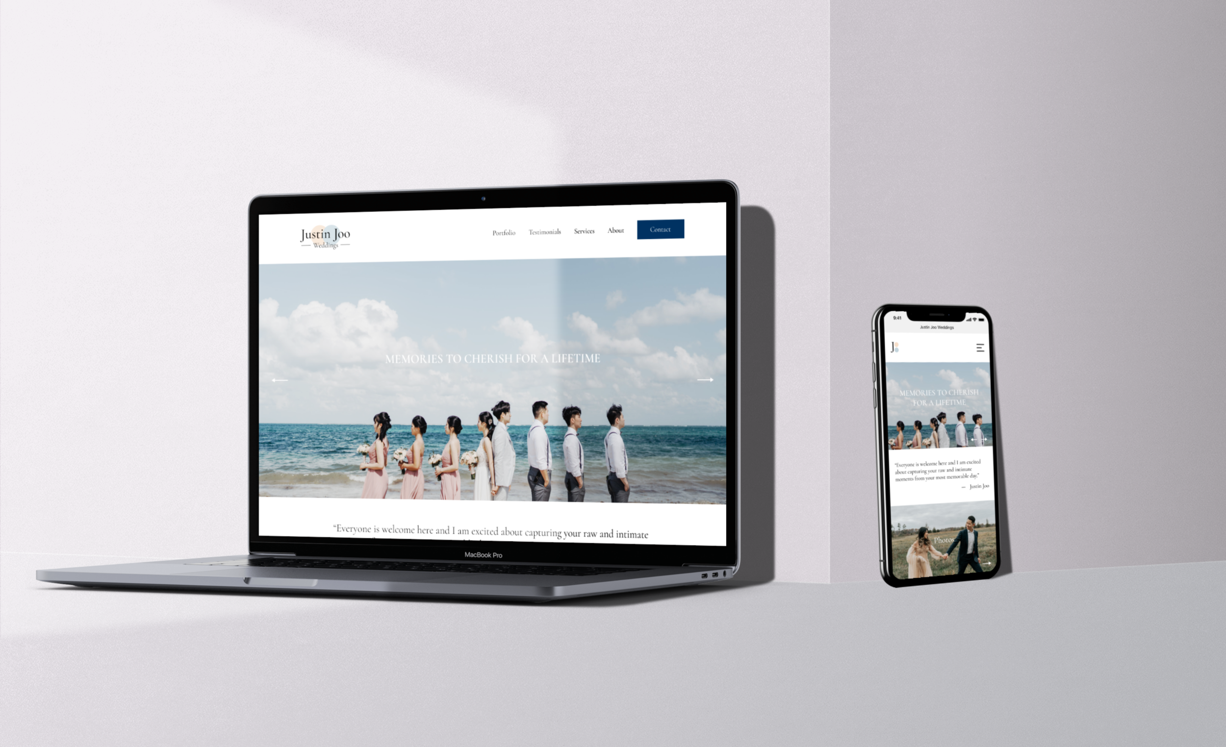
Justin Joo is a wedding photographer and videographer based in Toronto, Canada. With the growth of his business, he was looking to have his website redesigned to best reflect the quality of his work. A majority of Justin’s audience navigates to his website through his Instagram so he wanted to be sure that his new site would be designed responsively.
ROLE & RESPONSIBILITIES
UX/UI designer responsible for user research, UX/UI design, branding, prototyping, testing, and front-end developing
TIMELINE & TOOLS
80 hours utilizing Figma and Squarespace
THE CHALLENGE
Justin’s previous website was simple and did not contain much text as he noted he wanted to keep the site minimalistic. The biggest challenge with this site redesign was reorganizing the information architecture so that it would be easy to navigate and potential clients could find what they were looking for.
Another challenge was working within the constraints of Squarespace’s templates.
THE SOLUTION
The new site contains additional pages such as an FAQ and Services page to better communicate what Justin is able to provide for potential clients. His portfolio was also restructured to best highlight his wedding videography work as well as his photography work.
To overcome some of the constraints on Squarespace, I used custom CSS to code certain content styles.
Research
What concerns does Justin have about his current site and what are other photographers doing well?
RESEARCH GOALS
Understand overall process user goes through when searching for a wedding photographer or videographer
Understand what information users want to know about a wedding photographer or videographer before feeling comfortable inquiring/booking
Determine what the best information architecture would be so users are able to navigate around site and complete their goals
STAKEHOLDER INTERVIEW
Justin was interviewed to better understand his process, who his target clients are, and his concerns regarding the site.
About his clients & process:
90% from Toronto, 10% from Vancouver
Clients on average pay about $2500 - $3000 for his services
70% of the time he shoots with a team, 30% of the time he shoots weddings by himself
Current workflow involves emailing serious clients within 24-48 hours after their initial inquiry with more information about his pricing and to better understand their needs
Concerns about his site:
Not happy with the lack of responsiveness of his site especially in mobile view
Homepage doesn’t load properly and is an additional step for users to view his portfolio
A bit too simplistic
COMPETITIVE RESEARCH
Analysis of three wedding photographers’ websites was done to recognize any information architecture patterns and assess their strengths & weaknesses. Justin had noted that he enjoyed the interaction elements on Karen’s page and liked the premium-feel of June’s page. From reviewing a variety of other wedding photographer and videographer’s websites, it was common to see many sites have a large gallery displaying their work as well as a list of different service packages and starting prices.
Justin’s previous site had no clear packages listed and only included a starting price at the bottom of his photography & film pages.
Heuristic Evaluation
What are potential problems that currently exist on Justin’s site?
Ultimately, there were not many usability problems with Justin’s current site besides the homepage being animated (slowing down loading time) and requiring users to click a button to view his portfolio (additional step). Most of the challenges regarding his’s site fell under the organization of information such as nesting client testimonials in his photo portfolio page, including work that was not wedding related, and placing starting prices in low hierarchy positions on pages. After presenting this analysis to Justin, he agreed to add a service package page to be more transparent with clients about what services he offers.
User Interviews, Survey, and Existing Research
What are couples looking for when hiring a wedding photographer or videographer?
PROCESS & PARTICIPANTS
Two 20-30 minute virtual interviews conducted
Participants interviewed were either recently engaged or recently married
Aged 24 & 32, both females
Six responses were collected from a survey
Participants were either recently engaged or recently married
Research & Analysis Report conducted by Sheridan PRCC was provided by Justin
The group conducted:
A survey where they received 163 responses
Interviews with nine couples
Four who were not clients, two who were current clients, and three were past clients
FINDINGS
From User Interviews:
Finding a wedding photographer/videographer is one of the top priorities for couples when planning a wedding
Pricing and aesthetics of work is what users look for when browsing a photographer’s site
Users would only reach out if they were certain that they wanted to work with the photographer
From Survey:
83% discovered their photographer through social media or through referrals from friends/family
All participants reported that aesthetics of photos/video was the most important factor when deciding who to hire
Next most important was pricing of services, followed by photographer’s personality
50% indicated being interested in selecting a preset package service, 33% preferred having a consultation for custom services, and 17% was undecided
From Research & Analysis Report (March 2021, Sheridan PRCC):
74.3% of participants were women, 52.1% were between 25-31 years old
Majority were from Ontario and were East Asian
59.8% of client’s Instagram followers are women
Client had an influx of users to his website after he posted viral videos on TikTok
This report validated results I gathered from my survey of what users look for in a wedding photographer/videographer
Empathy
What is it like?
To best understand the thoughts, feelings, and process a user may go through to find the perfect wedding photographer or videographer, a journey map was created.
Information Architecture
How would someone navigate through the site?
For any newly engaged couple looking to hire a wedding photographer/videographer to capture their special day, there are quite a few decisions to be made before submitting an inquiry.
Rebranding
With the redesign of Justin’s website, he was also looking for a new logo to accompany the new site. Justin told me the story behind his current logo which incorporates rings to represent his wedding photography/videography work, but also to represent his engineering background. With this unique concept, I iterated on a few potential logos.
Mood Board
After meeting with Justin and understanding his personality, I put together a mood board to help hone in what the feel and aesthetic of his new website would be.
Wireframes
After researching, organizing flows, and establishing the branding, I began sketching low fidelity wireframes while being mindful of how to best display Justin’s work and services to engage potential clients. There were six main pages I began sketching for:
Homepage: highlighting a few of Justin’s best photos in the hero banner and also displaying his services
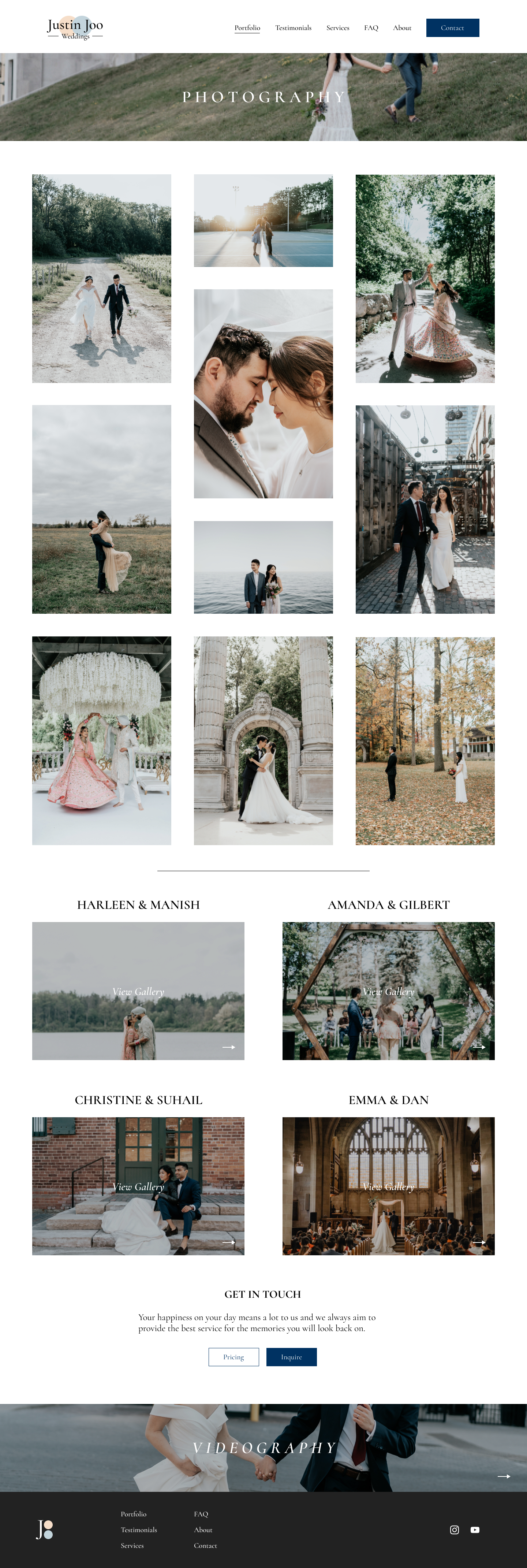
Photography Portfolio Page: consisting of a photo gallery that reflects his style and creativity
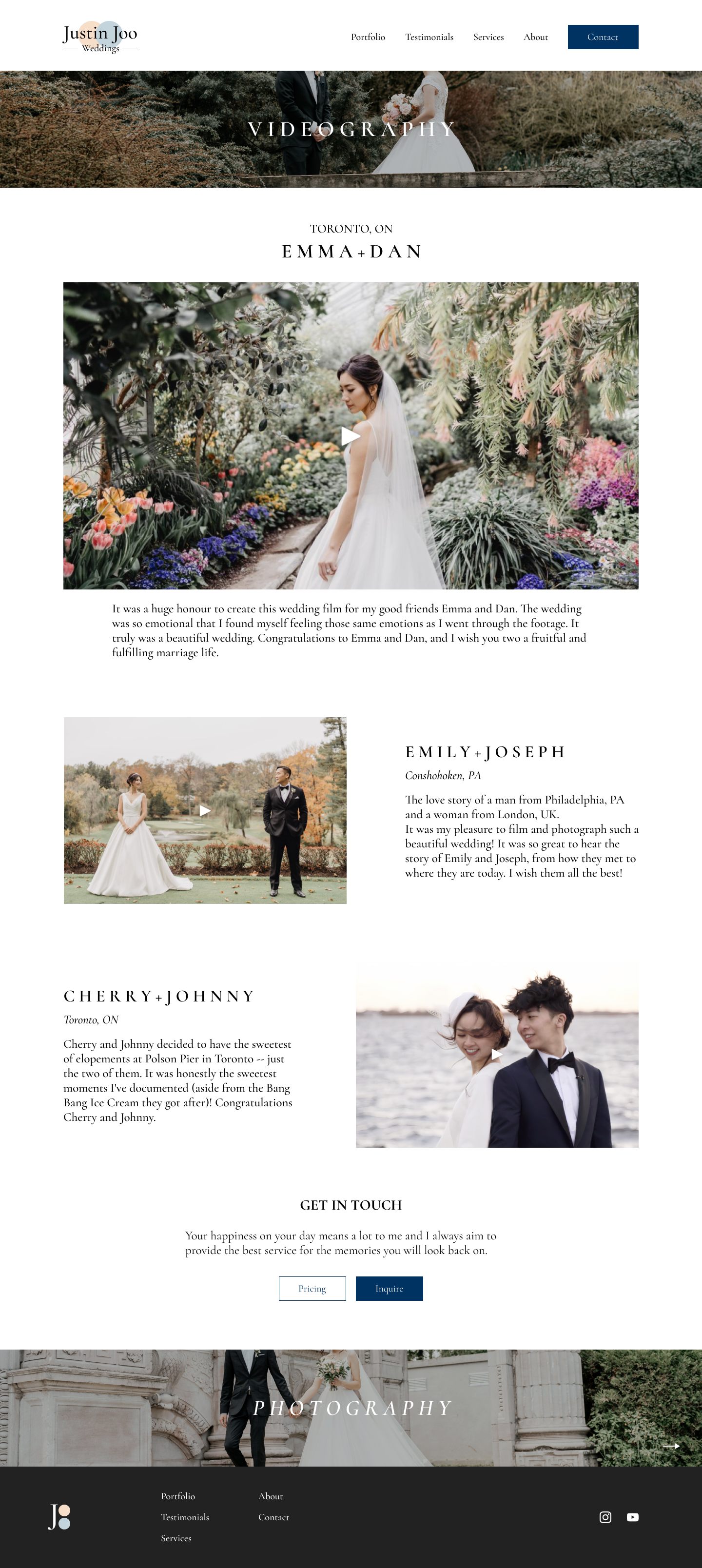
Videography Portfolio Page: consisting of his top 3 videos with a description about the couple & the day
Testimonials Page: what previous clients of his have said about Justin and how it was to work with him
About Page: for more information about Justin and his photography work outside of weddings
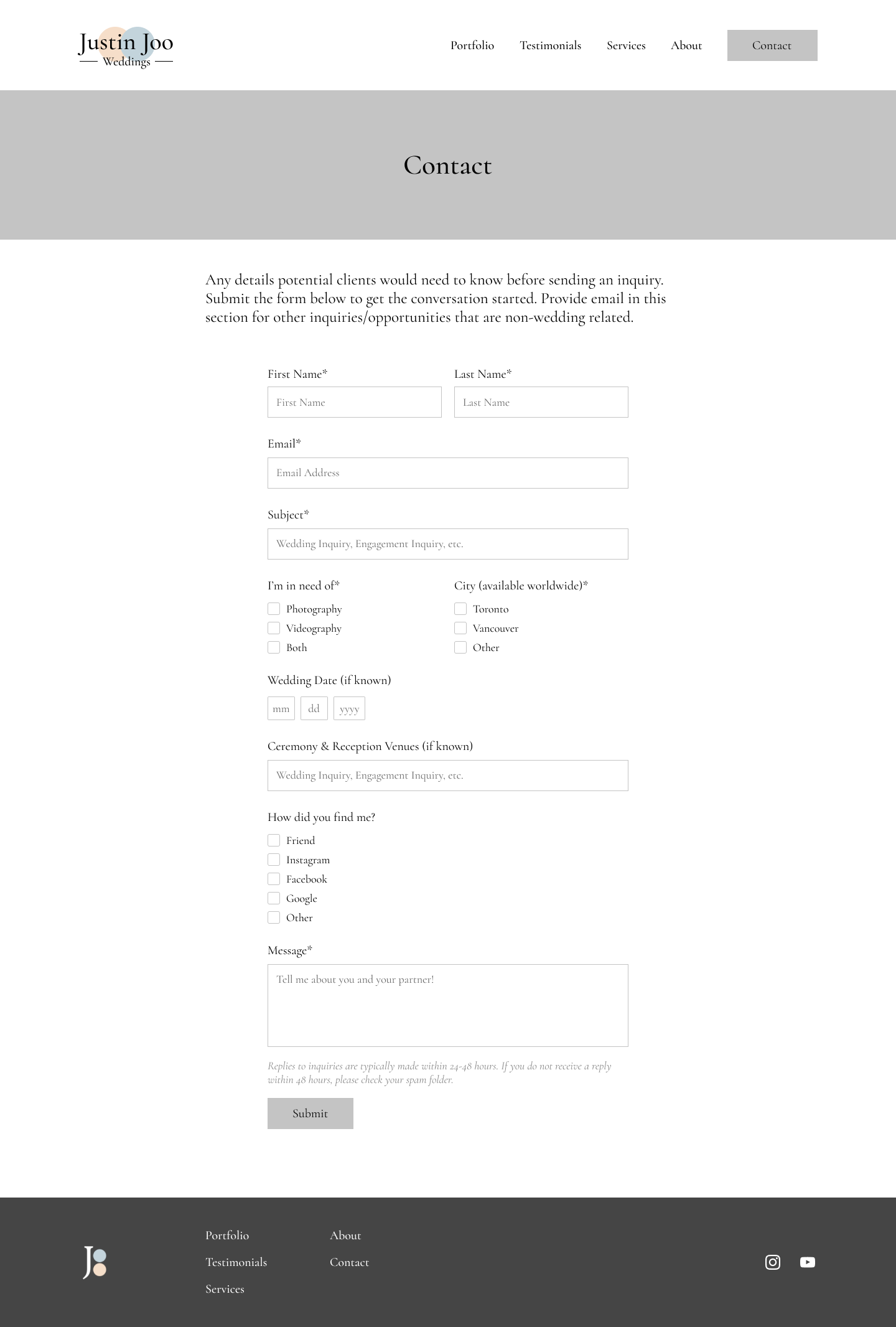
Contact Page: contains the main inquiry form with questions Justin would like to know the answer to before chatting with a client
Mid-Fidelity Wireframes
After discussing and reviewing the lo-fi sketches with Justin, we decided to add a Services page to further elaborate on the package options as well as a short FAQ. In order to best showcase his work, Justin also requested to have client galleries added onto the Photography Portfolio page so potential clients can experience what a full day shoot would be like. After having a deeper understanding his workflow, we decided to also add a section in the About page to highlight members of his team that he occasionally shoots with.
High Fidelity Wireframes
To bring my design closer to life, I created high fidelity wireframes that I then turned into a testable prototype on Figma.
Usability Testing
How well does the design work?
PARTICIPANTS & TASKS
7 total participants:
1 in-person test, 6 virtual tests
6 females, 1 male
1 recently engaged, 2 recently married, 2 in relationships, and 1 single
3 tasks to complete:
Find his portfolio & review photography/videography work
Find more information about services and pricing
Book a consultation
FINDINGS
There was a test completion rate of 100% and error-free rate of 100%; all users were able to complete all tasks with no errors
Some users noted that they would have liked to see more client galleries to view more of his work and feel that he has experience shooting many weddings
A few users noted that the FAQ made sense to be on the Services page, but if they were to actively search for the FAQs they wouldn’t know to look there
Some users wanted to know more information about engagement shoots
FURTHER ITERATIONS
After presenting these findings to Justin, we decided to make a separate FAQ page and reorganize the Services page. We also agreed to add two more client galleries to best showcase his style. Although users did note that they wanted more information about engagements and other specific details about the service packages, from a business standpoint Justin preferred folks to reach out to him with inquiries instead of laying out all the information on his site because he felt it might lead potential clients to bypass starting a conversation with him.
View iterated screens below.
Responsive Wireframes
Click below to view tablet and mobile screens!
Final Product
View a walkthrough of the final prototype below or click through the prototype yourself! The final website redesign was completed on Squarespace. Custom CSS coding was done to create a secondary button style for the Pricing CTA as well as adjust the button widths in the mobile view. Minor stylistic choices such as adjusting colors of dropdown menus for better visibility and removing underlines from the footer text were also done through custom CSS coding.
NEXT STEPS & LESSONS
It was a great learning experience to work with a client. I learned a lot about how to balance user input from research and testing along with the business goals of the client in order to design a product that was meeting user needs while also still being in line with client needs. In order to satisfy the client’s requests, I took initiative to learn a bit of CSS to adjust the website to fit as closely to the Figma prototype as possible. Also with the client’s initial concern with the mobile view, I made sure to add code that would optimize the mobile view.
With more time I would love to prototype the mobile screens and run more usability tests to assure the mobile design works as well as it did in the desktop view.


