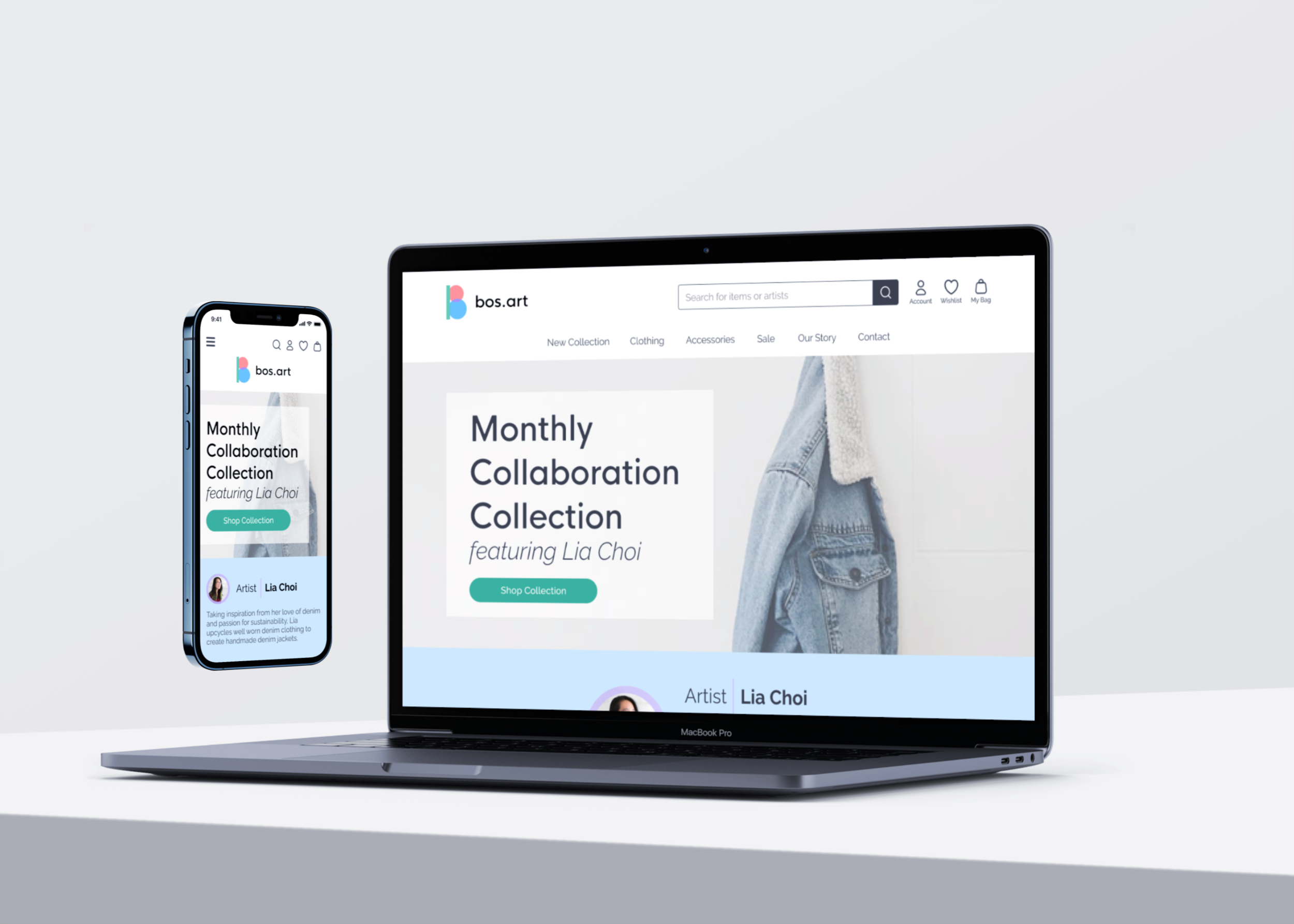
Clothing E-Commerce | Responsive Web Design
OVERVIEW
Bos.Art is a fictional clothing company based in Boston focused on selling unique clothing pieces designed by artists of color. They want to highlight the stories behind the designs and of the artists to build community and connection with their audience. Some of their core values as a brand include promoting inclusivity and building a sense of community.
ROLE & RESPONSIBILITIES
UX/UI designer responsible for user research, UX/UI design, branding, and prototyping
TIMELINE & TOOLS
2 months utilizing Figma, Miro, and Optimal Sort
THE CHALLENGE
Young adults, who are mindful of the clothes they wear, want to learn as much about them before purchasing so they feel good about their choices and about the artists they are supporting.
With a newfound online audience, Bos.Art is looking to have a responsive e-commerce website designed for customers to be able to easily purchase items and learn about their artists. They also need help refreshing their brand with a new logo.
THE SOLUTION
Utilizing the design thinking process of empathizing, defining, ideating, prototyping, and testing, I designed a responsive website with a functional prototype that spotlights a new artist, their collection, and their story every month. The site was also designed to have an easy, intuitive browsing and check out experience.
Research
What do we need to know and understand?
RESEARCH GOALS
Gain insight on the online fashion retail industry
Observe how existing fashion e-commerce sites organize apparel products and connect with their customers
Discover what habits users have when it comes to online shopping
Determine if users would be more willing to purchase an apparel item if they learned the story behind the design and artist
MARKET RESEARCH
Four categories of fashion e-commerce brands:
Social Curation Sites
Collaborative Consumption
Vertically integrated
Niche Online Marketplace
COMPETITIVE ANALYSIS
Brands like ModCloth have a niche audience (women who like vintage style clothes) and clearly values community, diversity, and inclusion. Other brands like Etsy and Society6 are great at showcasing many small artists.
User Interviews
How do people shop online and what are they looking for?
PROCESS & PROCEDURE
Four 30 minute virtual user interviews
Participants were between the ages of 23-24 and are experienced with online shopping
Interview was split into 2 segments:
Question Section: participants described their shopping habits, motivations, and goals
Observation Section: participants were asked to open any online clothing store and verbalize their shopping process from browsing to purchasing
FINDINGS
Attitudes:
Users prefer shopping in person to try on items
Most users are willing to pay more for clothes created by small artists
Most are interested in learning more about an artist’s story
Behaviors:
Most sort items by price (typically from low to high)
Users like to browse for long periods of time (45+ mins)
“I lean towards more sustainable brands and enjoy brands with a good message or mission”

Empathize
Defining the user
To further empathize with the users I was designing for, I took my findings from the user interviews and developed a persona and empathy map to center user goals and needs. Users in our target audience, such as Jamie, enjoy shopping for unique apparel items and supporting small artists/designers.
Ideation
Where can users find certain information and what’s the “happy path”?
TASK FLOW & USER FLOWS
Before jumping into sketching wireframes, I defined the main task users needed to complete in order to efficiently build out the necessary screens to help users accomplish their goal. I also considered what decisions users would have to make as they try to complete their goal.
INFORMATION ARCHITECTURE - CARD SORTING
To be sure users are able to find the information they are looking for, card sorting was conducted (via Optimal Sort) with 6 participants. They were asked to categorize 20 items into groups that made the most sense to them.
Wireframes
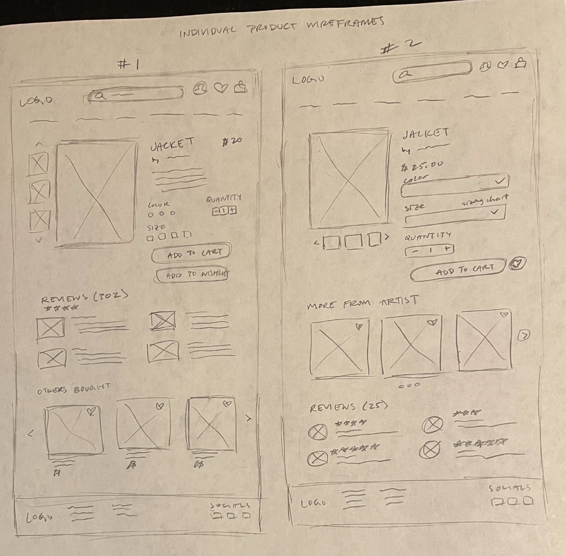
With the navigation path established from the task and user flows, I began sketching low fidelity wireframes for four main pages:
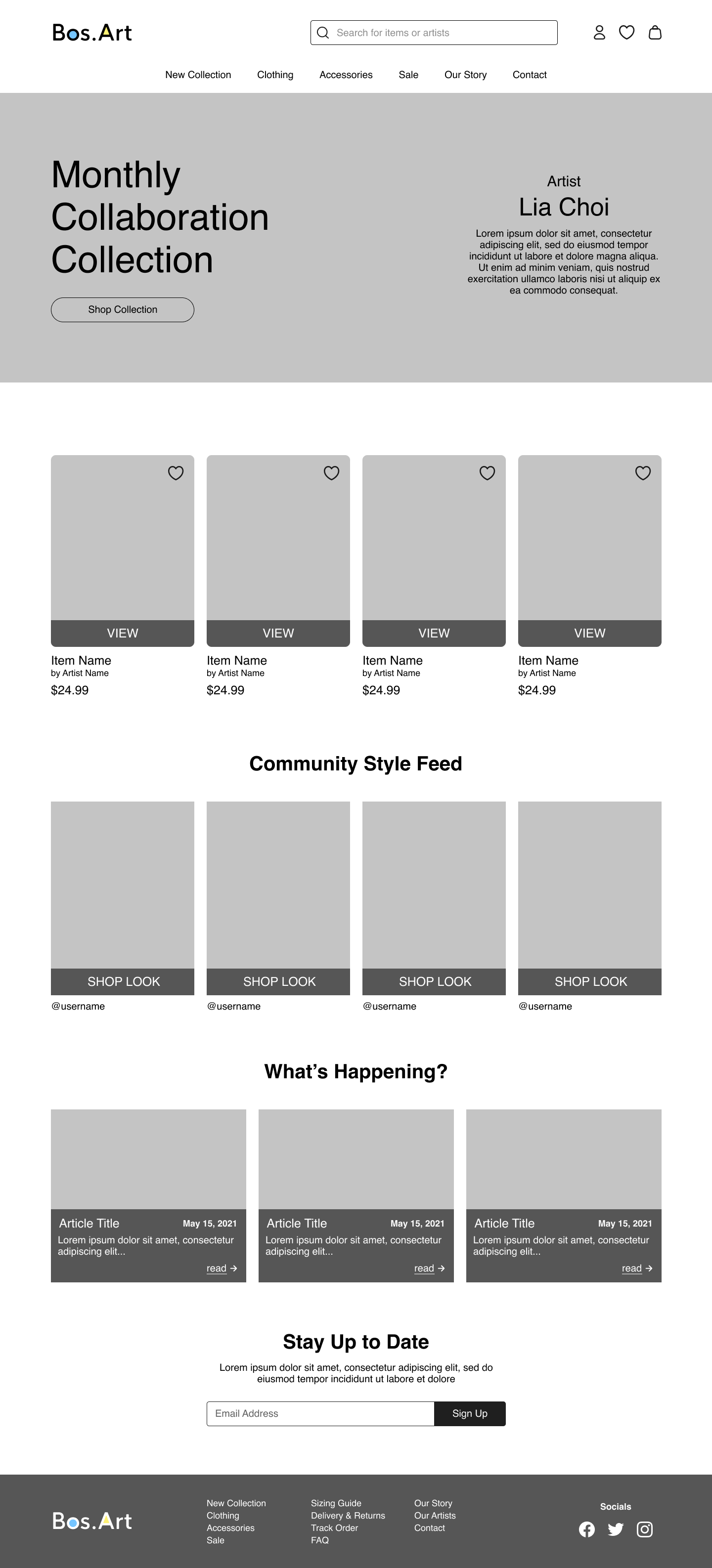
Homepage: landing page featuring the newest monthly collaboration collection and the artist
Product Gallery Page: displays a layout of multiple products as well as a filter that allows users to customize which items they see
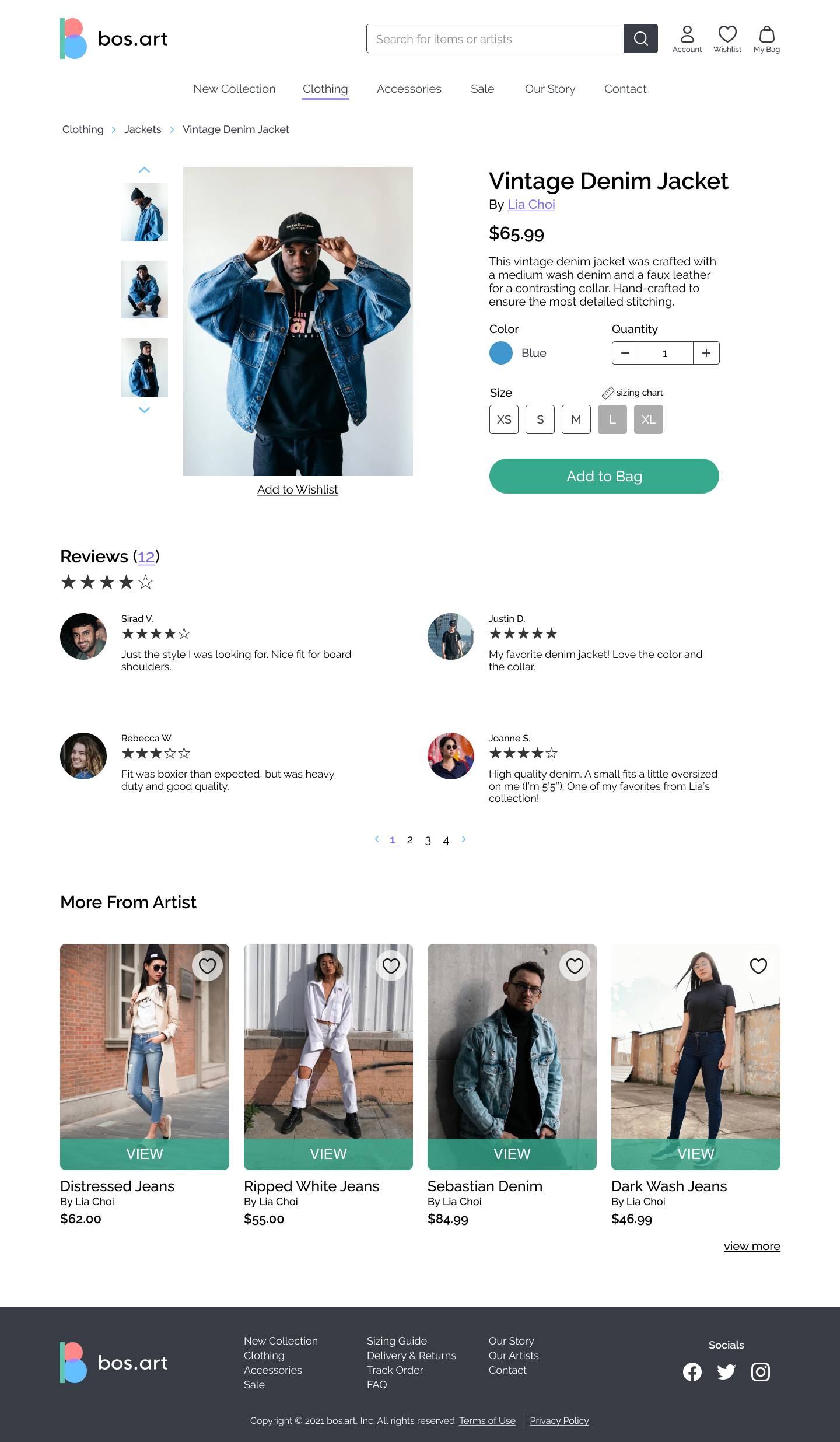
Individual Product Page: provides more details on a specific product; user can select desired options (sizing, color, and quantity) before adding to bag
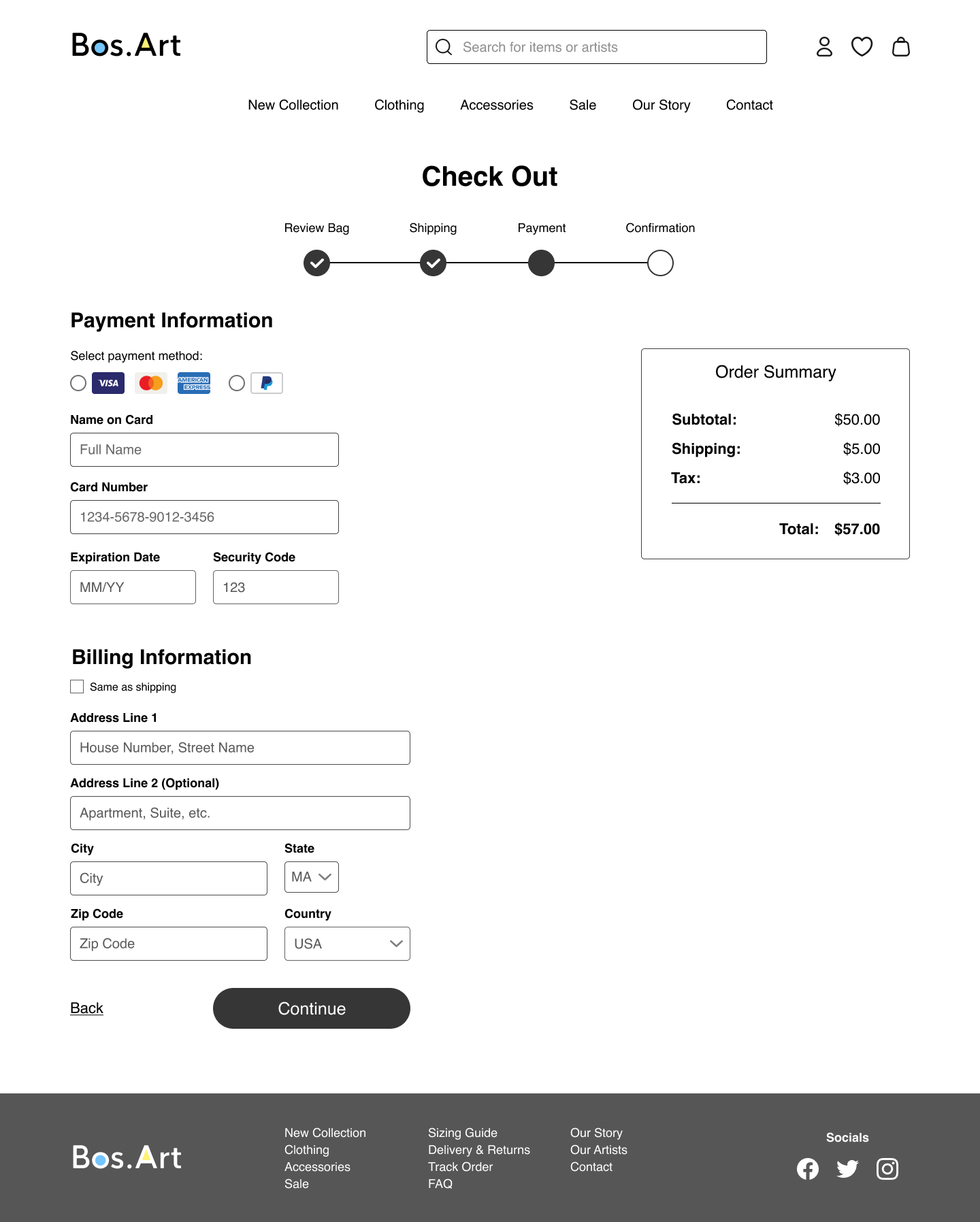
Check Out Pages: multiple pages that walk user through completing their order
Mid-Fidelity Wireframes
After receiving feedback, I turned my best sketched wireframes into mid-fidelity ones on Figma.
Responsive Web Design
Mid-fi wireframes of Bos.Art’s homepage was designed responsively to fit desktop, tablet, and mobile screens.

Branding & Styling
The overall vibe and aesthetics
LOGO ITERATIONS
After explaining the brand’s mission and values, other designers gave feedback and concluded that the middle row logos were the strongest iterations.
Brand Keywords
Inclusive, fun, community, simple
Style Tile & UI Kit
To build a cohesive brand, a style tile was created before designing the high fidelity wireframes. Bright, pastel colors were utilized to evoke the feeling of fun and match Bos.Art’s tone. A UI kit was built to display key components that would be used in the design.
High Fidelity Wireframes
After applying the styling to the mid-fidelity wireframes, an additional page was designed to improve the navigation from the Monthly Collaboration Collection CTA.
Usability Testing
How well does the design work?
PARTICIPANTS & TASKS
5 in-person tests conducted
3 tasks to complete:
Find more information on the monthly collaboration artist, Lia Choi, & her denim collection
Add “Vintage Denim Jacket” to shopping bag
Check out & place order for items in bag
FINDINGS
1st and 2nd task had test completion rate and error-free rate of 100%
3rd task had test completion rate of 100% and error-free rate of 40%
2 users wanted to check out by clicking on bag icon which was not built out in the prototype
1 user was prompted to re-add item to bag to continue the task
FURTHER ITERATIONS
The bag icon was made interactive in the prototype for a smoother check out process
Options to select apparel size was also built out to increase user control and freedom
Final Product
View a walkthrough of the final prototype below or explore it yourself!
NEXT STEPS & LESSONS
With more time, I’d love to expand upon building out an artist bio page so users are able to learn more about and connect further with the artists at Bos.Art. To further hone in on the brand’s mission to highlight artists and build community, it would be great to explore the blog and community feed portion in more detail as well.
Overall, this case study enabled me to put the design thinking process to action and realize the value of iteration after researching, testing, and receiving feedback.


