Nike Run Club | Running for Charity
OVERVIEW
Note: This project is a conceptual project and has no official affiliation with Nike.
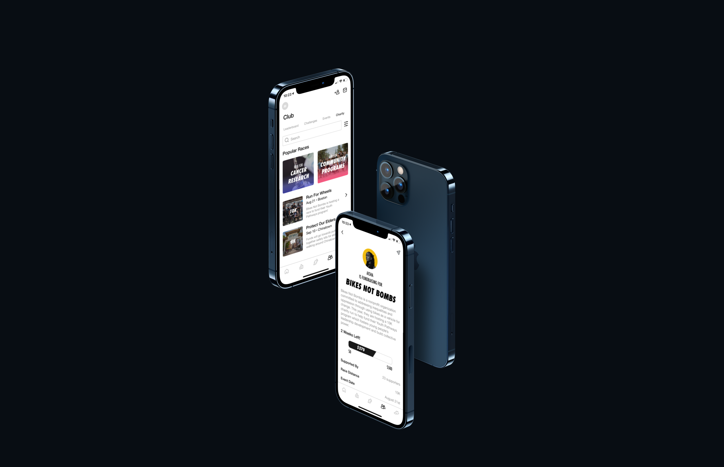
Nike pushes for innovation and strives to not only create products that are inspiring to athletes, but also advocate for social good. With that in mind, I thought a meaningful addition to the Nike Run Club (NRC) mobile application would be a charity run feature where runners can choose to join an existing charity run or host one of their own.
ROLE & RESPONSIBILITIES
UX/UI designer responsible for user research, UX/UI design, prototyping, and usability testing
TIMELINE & TOOLS
80 hours utilizing Figma and Maze
THE CHALLENGE
Whether you’re into cardio or not, finding motivation to go on runs can be tough. With the increase in awareness of social issues, more folks are also looking for ways to support different communities.
THE SOLUTION
What better way to motivate runners than by providing a meaningful cause to run for? Adding a charity run feature on the NRC app gives an added boost to encourage runners to lace up their shoes and go for a run.
Research
What potential problem is left unsolved by Nike’s NRC app?
RESEARCH GOALS
Determine if runners would be interested in or motivated by a charity run feature
Learn about running habits and how users interact with run tracking apps
Identify any frustrations users have with run tracking apps
BRAND RESEARCH
Back in 2016 Nike updated their NRC app and received an overwhelming amount of negative reactions from users as key motivational features like challenges and leaderboards were removed. This revealed how much users valued motivational aspects of the app and led to Nike reinstating those features.
COMPETITIVE RESEARCH
A big competitor to Nike is Strava. They provide many similar features as NRC, but also optimize the ability for users to build communities through creating clubs and groups.
Another competitor is Map My Run created by Under Armour. One of their key features allow users to track strides and cadence during runs if users purchase Under Amour’s smart shoe.
A major con that many other run tracking applications have is that they lock certain features behind paywalls or have large, distracting advertising placement.
User Interviews
How interested would runners be in a charity run feature?
PROCESS & PARTICIPANTS
Five 20-30 minute virtual interviews conducted
Users interviewed were runners:
Ages 22-32
4 females & 1 male
FINDINGS
Common Habits & Attitudes:
Users run outside, listen to music as they run, and track their runs through smart watches
Are unmotivated to run if too tired, too busy, or weather is bad
Common Motivations:
Run to maintain mental and physical health
Run with friends, family, or significant other
Creating new music playlists to run to
Thoughts on Run Tracking Apps:
Are interested in tracking distance, pacing, and calories burned
Common pain point is struggling to sync apps to smart watch (wifi dependent)
Thoughts on Charity Runs:
All runners expressed interest in participating in charity runs
Even more interest if charity is one they’re personally connected to
Most noted they enjoyed running in in-person events as virtual runs don’t have the same energy
Ultimately, through these user interviews it was validated that a charity run feature would be of interest to runners. Joining in-person race events is a desire runners have as the pandemic eases up.
Empathy
Persona
To continue being mindful of who I was designing for, I created Esther — an avid runner and supporter of her community.
Information Architecture
Where does this charity feature fit in?
After exploring the app, I noticed that the Club screen displays a leaderboard, challenges, and general Nike events happening in a user’s area. The charity run feature, being a community and event centered feature, intuitively fit into the Club screen. Task and user flows were created to further map out what actions and decisions a user may take to complete their goal.
UI Kit
Before jumping into wireframing, I wanted to assess Nike’s current branding and styling so I’d be able to best design and add the charity feature without disrupting Nike’s current UI.
Wireframes
After determining the information architecture and flows, it came time to sketching the screens needed to build out the charity run feature. There were four main pages I began sketching for:
Charity Run Page: displays various charity run events that are being hosted at the moment and also allows users to host their own charity race
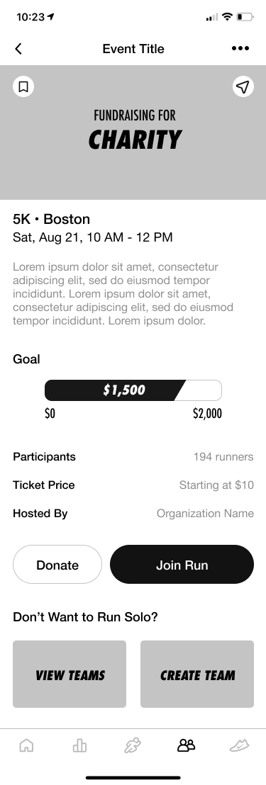
Individual Charity Event Page: includes information about the charity and event details such as race distance, time, location, etc. This page also provides options for a user to join the race or just donate.
Registration Pages: once a user decides to join a race, it brings them to a registration page where they input contact, health, and payment information
Confirmation Page: assures that users have successfully registered for a charity run
Mid-Fidelity Wireframes
After discussing and reviewing my lo-fi sketches with my mentor, I designed an additional page that displays a runner’s fundraising profile after registering for a charity run. An important aspect to participating in a charity run is not only running the race itself, but also being able to collect donations.
High Fidelity Wireframes
To bring my design closer to life, I created high fidelity wireframes that I then turned into a testable prototype on Figma.
Usability Testing
How well does the design work?
PARTICIPANTS & TASKS
12 total participants:
1 in-person test
2 virtual tests
9 participants via Maze online testing
3 tasks to complete:
Find the charity run page
Join and register for the “Run For Wheels” charity run
Share your fundraising profile to Facebook to start collecting donations
FINDINGS
All participants were able to find the added feature, however, there was an error-free rate of 66.7%
Many noted that they had to explore a bit since they were not familiar with the app and did not know what the bottom navigation icons meant
92% of participants followed the ideal path to join and register for a run
“It was easy and familiar to me.” - Participant 2
Many Maze participants mis-clicked on the midline ellipse menu on the confirmation page thinking it would lead them to sharing the fundraising profile
FURTHER ITERATIONS
The biggest pain point noted from the usability testing was users having trouble finding the feature due to the ambiguity of the bottom navigation icons. Considering many of the participants that tested the prototype were not current NRC users, this observation made sense. I assume that if I had tested with more NRC users, they would have had an easier time finding the new feature. Since I wanted to maintain the existing UI of the app, I decided not to add text under the navigation icons. However, it would be cool to see Nike clarify the icons with text to help increase user accessibility.
To clarify the task of sharing a user’s fundraising profile, I removed the midline ellipse menu and adjusted the CTA button’s text on the confirmation page. One participant noted that he didn’t know if he had successfully shared the fundraising profile so I created an overlay menu of social platforms that users could share to as well as a success notification after sharing.
View iterated screens below.
Final Product
View a walkthrough of the final prototype below or click through the prototype yourself!
NEXT STEPS & LESSONS
It was a fun challenge designing within the constraints of an existing application. If I had more time for this project, I would want to build out the creating teams feature as my research led me to conclude that many runners enjoy the social and motivational aspects that come with running with others. It would also be interesting to build out the host a run feature.
This project made me think critically about existing applications and what problems have yet to be solved. As exciting as it was to imagine myself on the Nike design team brainstorming a new feature, it’s always best to ground ideas with support from research before spending time, energy, and resources to create a feature that users might not even be interested in.


